This blog post originally appeared on the SAGE Public Understanding of Science blog, and is re-posted here with permission.
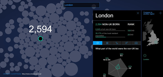
Researchers across several disciplines use data visualisations to communicate with public audiences. It may be tempting to think visualisation provides straightforward windows into scientific studies, helping people access significant findings quickly and efficiently. But, by studying how non-academic users in Great Britain engaged with visualisations about international migration, I found that creating, communicating, and perceiving data visualisations are anything but straightforward. This is especially true now, when lots of groups use visualisation for advocacy and persuasion. In response, I develop the idea of ‘visual brokerage’ to describe how these processes—and visualisations themselves—exist within social, political, and cultural contexts. This matters for bringing the practice of both data visualisation and research communication into closer conversation with the experiences and abilities of users.
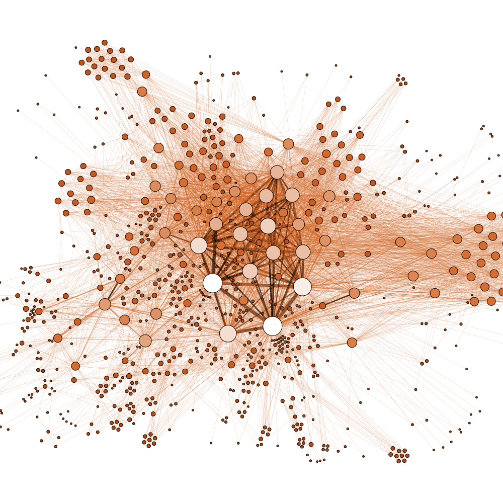
Visualisations are not neutral
Colleagues and I started the ‘Seeing Data’ project to understand how people engaged with visualisations, as well as how designers contributed to this process. What we found is that the process of visualising data is full of choices and conventions about what counts as good or effective, in addition to what is technically possible. These choices have consequences for the ways that data gets represented—and, for viewers, how people make sense of that data.
The role of knowledge brokers
In my research that specifically focuses on how researchers visualise data about international migration, I draw attention to the role of knowledge brokers. These are people or organisations that translate (and sometimes transform) information for public audiences. They may include journalists, think-tanks, or charitable foundations; designers and visualisation practitioners; and even the data collectors or sources themselves. Whether explicitly (through advocacy or persuasion) or implicitly (through organisational practices or habits), these brokers contribute to the eventual visualisation product.
What’s more, users engage with visualisations through these brokers. In the article, I identify two ways this happens. First, people make sense of the data by evaluating the credibility of the brokers, whether it’s the organisation that sponsored the visualisation or the public body that produced the underlying data. Second, people engage emotionally with visualisations, particularly by feeling surprised either at the content or the design features. (Elsewhere, my colleagues have identified other kinds of emotional responses to data visualisations).
Why visual brokerage matters
The study of knowledge brokerage, both in science communication and public policy, has a long history. By applying this idea to data visualisations, my concept of visual brokerage aims to make two contributions. It bridges how individuals perceive and make sense of visual information with the wider social and political factors that partly determine how knowledge gets used in different settings. And, it suggests lessons for visualisation practice, such as linking design choices with a keen understanding of users’ own skills and situations. Going forward, there is plenty of more work—both theoretical and practical—to be done on both of these fronts. Moreover, the real challenge is how to bring these two approaches together.
Read more: Visual brokerage: Communicating data and research through visualisation