When it comes to migration, we see lots of visualisations. For example, the UK’s Office for National Statistics (ONS) created this image to show how the country’s largest foreign-born groups have changed since 1951. This interactive chart called ‘The Global Flow of People’—published in Science magazine!—used UN data to show how many people moved among the world’s regions since 1990. And the Migration Observatory had a whole project that was based on maps that showed migration patterns for each region of the UK based on Census data. You can find out here, for example, where 4 out of 5 of the foreign-born people in 2011 were other Europeans (spoiler: it’s not London, but Lincolnshire).
When you click around these visualisations, how do you feel? When you see a chart in a newspaper or on Twitter, how do you react? ‘I believe that one: it seems right’, we might say. Or, ‘oh, so that’s what is happening in my area or country—I’m going to send it to my friends’. But did you ever think that these visualisations might be trying to persuade you—to get you to see the world in particular ways, maybe without you even realising it?
This is exactly the question that I along with colleagues Helen Kennedy (University of Sheffield) and Rosemary Lucy Hill and Giorgia Aiello (both at University of Leeds) ask in our recent research into visualisation. (Click the link to see examples of everything in this blog post). It’s part of a larger AHRC project called ‘Seeing Data’ that aims to both understand how people make sense of visualisations as well as provide resources to raise ‘visual literacy’ through our website. We wanted to peel back the layers of glossy graphics and visually-pleasing pixels to understand how visualisations convey a sense of believability—of being scientific ‘facts’, of being ‘evidence-based’, of being ‘true’. And, as a result, worthy of being understood, shared, or used to inform others.
Based on interviews with 13 internationally field-leading visualisers, as well as detailed analysis of ten visualisations themselves, we found at least four different ‘conventions’—or practices that are widely understood, shared, and accepted by a group—that make visualisations appear to be objective: (1) two-dimensional viewpoints that appear to remove perspective; (2) geometric shapes and lines that create tidiness and order; (3) clean, uncluttered layouts that suggest simplicity; and (4) links to data sources that imply transparency and trustworthiness.
Two-dimensional viewpoints
Many visualisations like maps use a top-down perspective, like the Migration Observatory census maps, or a front-on view in the bubble chart example from the ONS. These viewpoints allow the user to see everything at once by hovering above the country, or above the data, in what some call a ‘god-like’ way (Kress and van Leeuwen 2006: 149). Using a two-dimensional view suggests objectivity by removing perspective—although by doing so, it actually replaces it with another. Sure, there are good professional reasons to use this approach: it helps viewers read and compare the specific values within the visualisation, for example. But believing this perspective is the only and automatically best way to show data arguably privileges ‘objectivity’ over other aims (Harding 1986).
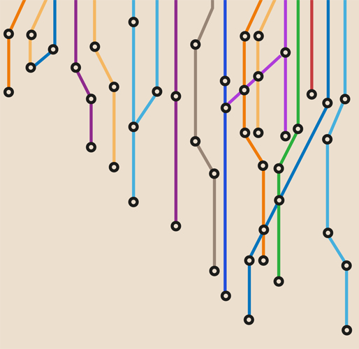
Geometric shapes and lines
Rectangles, squares, and circles are all key features of many visualisations. Sometimes, the printed page or screen dictates how large visualisations can be, so rectangles tend to be the dominant way that spaces are divided up. But circles and other shapes can appear within these uses, too: the ‘Global Flow of People’ example uses curves and arcs with clear divisions to indicate different regions. All of these shapes represent or symbolise whatever is being depicted in the same way, suggesting that all the data points are equally true and mean the same thing (Manovich 2011). But, in the case of migration, we know that numbers do not necessarily correspond with lived experience. The smooth arcs in the ‘Global Flow’ imply smooth journeys: no ‘third-country nationals’ or ‘transit countries’ or ‘undocumented migration’ here!
Clean, uncluttered layouts
Many visualisations lack decoration, instead opting for a ‘no-frills’ approach. This partly practical, to help viewers find the important parts of a chart rather than distract them. A visualisation pioneer, Edward Tufte (1983), famously called this the ‘data-ink ratio’: more space in a visualisation should be dedicated to information rather than other elements. But this convention rubs off onto the information itself, to suggest a high degree of clarity when in fact the data (and the way they were collected) might be complicated. When we are presented with a simple, straightforward chart—with all the extra, and possibly contradictory, material taken out—it conveys a sense of finality and truth without bias. ‘Here is the information, directly taken from the data’, we might think.
Links to data sources
Another convention, particularly among online visualisations, is including a way to access the original dataset, or at least a citation to indicate who collected the data. On the one hand, this suggests credibility: if the designers have put the original data alongside their creation, then they trust their work enough to invite others to test it. But on the other hand, the mere presence of this link may already accomplish this test. After all, many people won’t have either the skills, desire, or time to actually check the work.
Nearly three decades ago, two sociologists remarked that ‘[d]epiction, picturing and seeing are ubiquitous features in the process by which most human beings come to know the world as it really is for them’ (Fyfe and Law 1988: 2). By looking at how visualisations are made, we want to show how conventions—those commonly accepted ways of doing things—contribute to how we see the world in particular ways. For migration studies, a field that encounters highly contested, contradictory, and complicated processes, I would further argue that we need to be especially aware of these conventions either when we see visualisations of migration data or make our own.
This post is based on a recently published journal article: Kennedy, Helen, Rosemary Lucy Hill, Giorgia Aiello, and William L Allen (2016) The work that visualisation conventions do Information, Communication & Society, DOI:10.1080/1369118X.2016.1153126 (Pre-print version available here)
Citations
Fyfe, G. and Law, J. (eds). (1988) Picturing Power: Visual Depiction and Social Relations. London and New York: Routledge
Harding, S. G. (1986) The science question in feminism. Milton Keynes: Open University Press
Kress, G. R., & Van Leeuwen, T. (2006) Reading images: the grammar of visual design (2nd ed.) London: Routledge
Manovich, L. (2011) What is visualisation? Visual Studies, 26(1), 36-49
About the Author: Will is a Research Officer with The Migration Observatory and COMPAS. He works on the relationship among media and public opinion on immigration, as well as how migration statistics are perceived, used, and visualised by non-academic groups. For more information on Will’s work, see his website or follow him on Twitter.